How do you earn someone's trust while they wait months for their vehicle?
VML + Ford Motor Co.
In Short
Customers who ordered a custom Ford were waiting months with little idea of where their vehicle was or when it would arrive. I helped design and test an end-to-end ordering journey that put status, trade-offs, and control back in their hands.
My Role
Senior UX Designer, sharing the design work with one other senior designer. I joined in July, after a client workshop had set the direction, and did most of the hands-on design: timeline sketches, the component library, page mocks, the configurator, and the prototypes prepared for user testing.
Results
5-stage journey, from waitlist to delivery • Refined through user testing and client co-design sessions • Final prototype built for remote, unmoderated testing
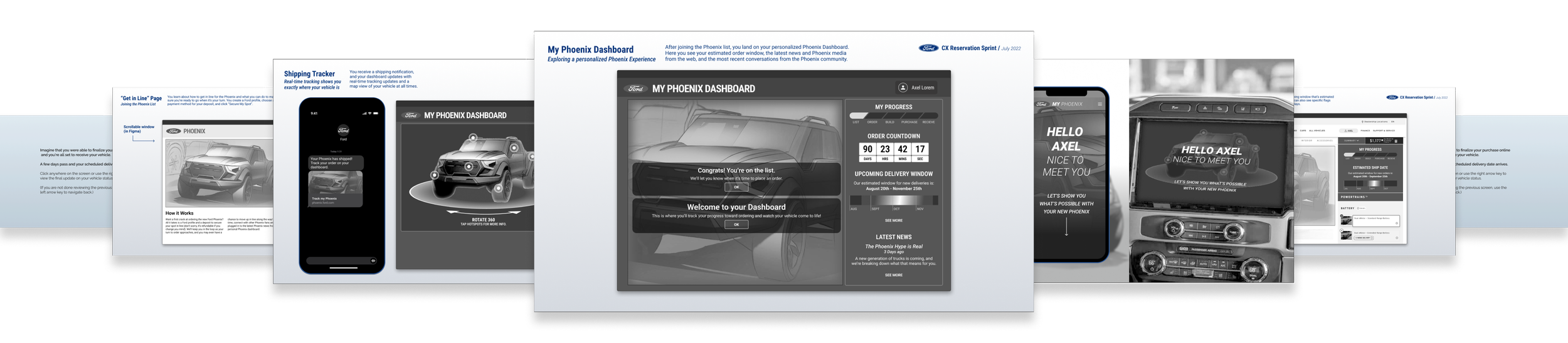
The final prototype: order status, trade-offs, and next steps in one place, tested with customers across several rounds.
Beginnings
Amid global supply chain disruptions, customers who reserved a custom Ford were often waiting months, with no meaningful updates and no clear idea of when their vehicle would arrive. For one of the biggest purchases people make, that silence felt like being forgotten, and it put their trust in Ford at risk. So we asked: how might we give customers clarity and control during a wait no one could shorten?
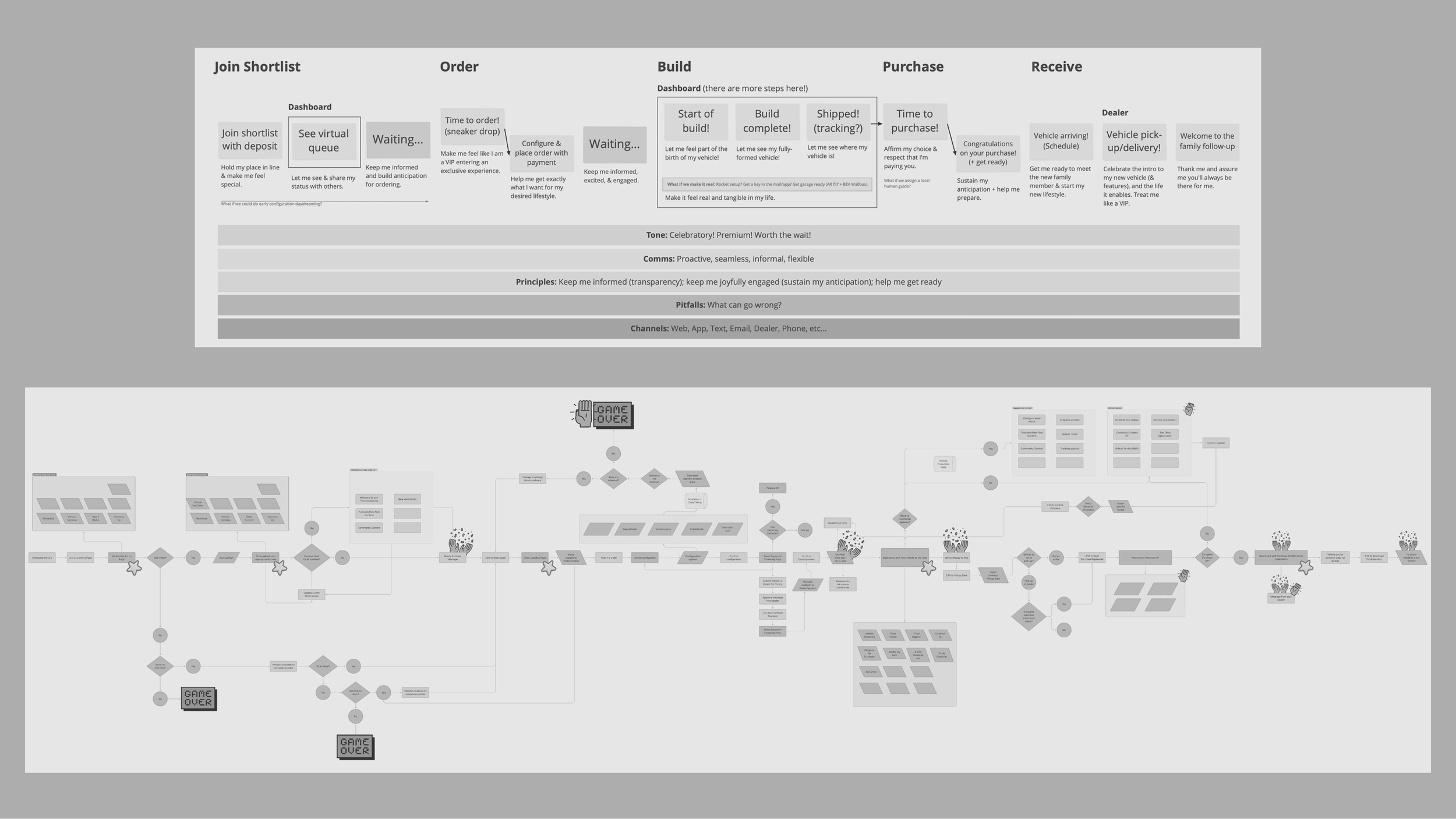
The team had already mapped touchpoints, behaviors, and pain points. I collaborated with Design Leads to turn those findings into a journey people could use.
From Research to Wireframes
I joined in July, after a three-day client workshop had mapped the journey and its pain points. The challenge was turning those findings into something customers could actually use.
I shaped them into wireframes and desktop screens around five stages: Waitlist, Order, Production, Shipping, and Delivery, each built around a real choice in the customer’s hands. I built the component library and most of the page mocks, then an order dashboard that showed every state of production and delivery. I also built the configurator so the estimated ship date and price recalculated with every option, letting customers see what each choice would cost them in time before they committed.
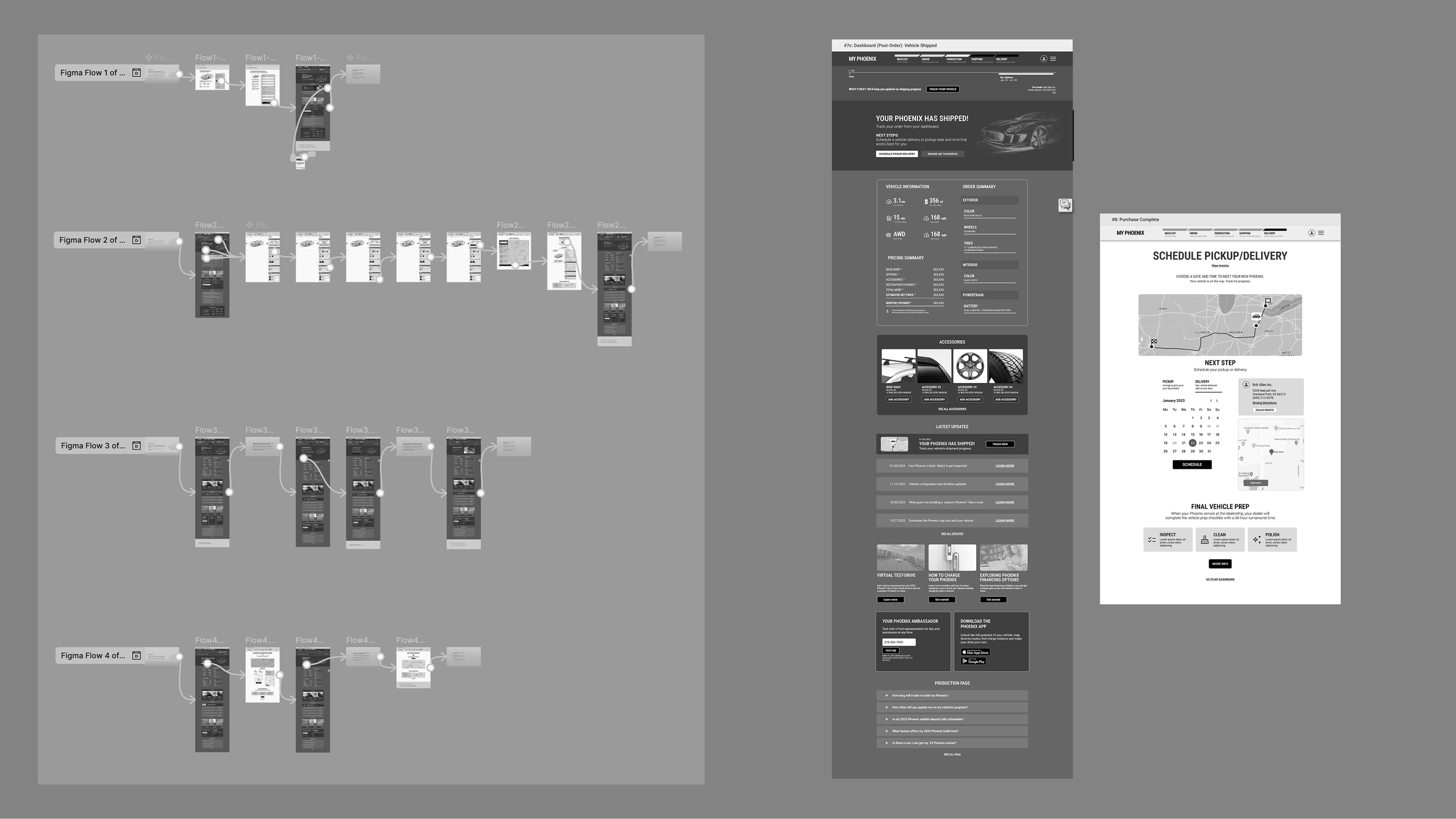
Left: I built a simple Figma prototype for user testing.
Right: the order dashboard in several states of production and delivery, so customers always knew where they stood.
Solving the Timeline Together
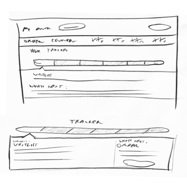
Ford’s team was focused on one unresolved detail: how to show a months-long order and delivery window so it felt honest, not alarming. Until it was solved, the rest of the journey was on hold. I sketched a wide range of versions, from countdowns to calendar ranges to dial gauges, and worked through them with Ford’s client team over several sessions. Their feedback and our testing pointed to the same answer: a slim header with the date range and countdown above the fold, so customers saw where they stood without scrolling.
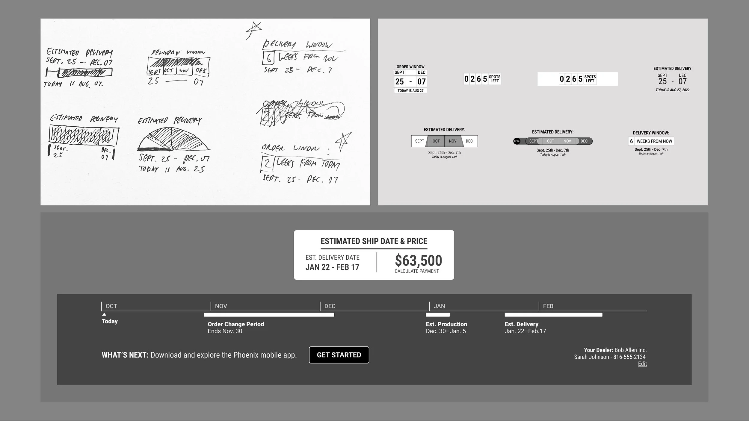
Top: I explored various ways to illustrate a timeline in a small, compact amount of space.
Bottom: the final timeline as displayed on the desktop dashboard and smaller side-rail component.
Designing Around the Dealership Model
Individual dealers handled final delivery and accessories, which limited how much of the journey Ford could promise directly. Updates also had to work across two channels: a desktop microsite, and texts and mobile messages.
Through team critique and stakeholder alignment, I refined the screen flows, wireframes, prototypes, and micro-interactions so customers received consistent updates by text and mobile, without either channel becoming a bottleneck. I added a dealer selection step that showed each dealer’s own price and ship date, and ended the journey with a named dealer texting the customer that they were on their way.
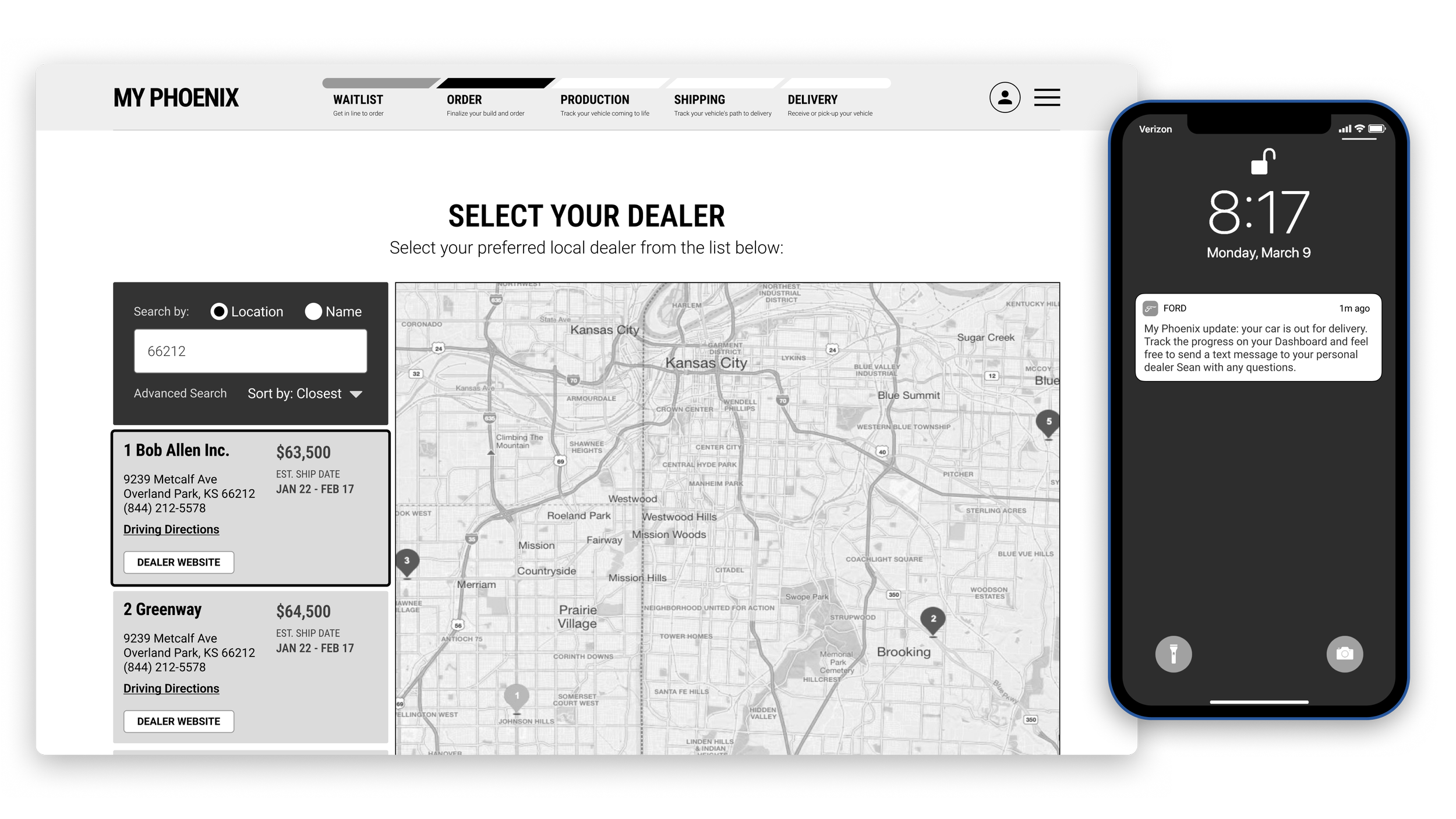
Left: The Dealer Selection step from the Order phase.
Right: Real-time mobile alerts informing the customer that their delivery is on the way.
Validating Thru Testing
I prepared the Figma prototypes and exports for several rounds of remote user testing, then pushed for changes based on what we heard. People confused getting in line with placing an order, so “List” became “Waitlist,” with an FAQ and an order-window countdown. Most said they wouldn’t trust changing their order by text, so I moved the build trade-off from SMS to an “Action Needed” card on the dashboard, with the price adjustment spelled out. Casual updates moved from text to email, saving texts for moments that needed a decision.
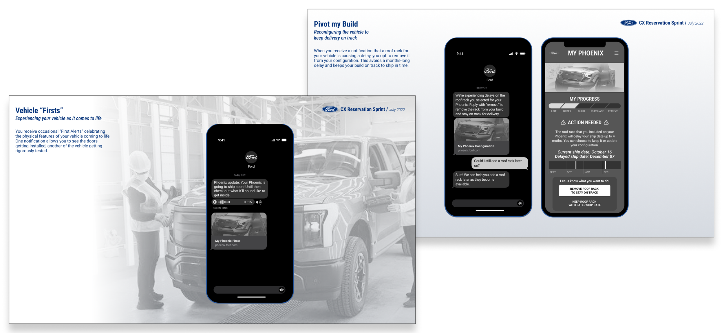
Screens from the final prototype, built for remote, unmoderated user testing.
Lessons & Learnings
Future-facing experience work doesn’t always ship as designed, especially when it asks an organization to rethink long-standing processes and partner relationships. This project taught me to map business constraints, like the dealership model, as carefully as user needs, and to bring those stakeholders in early. Next time, I’d bring rough options to an open client concern sooner and timebox the decision, so one unresolved detail doesn’t hold up the rest of the journey.