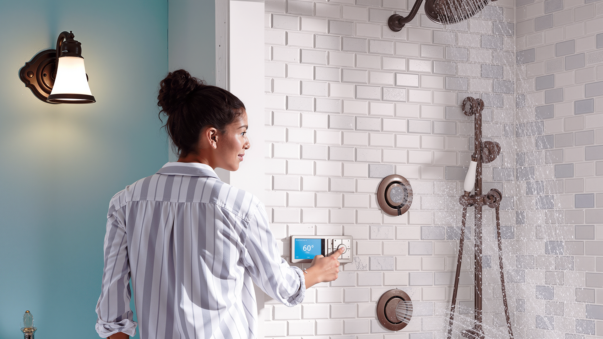
U by Moen
A digital interface for a connected smart shower
Blink UX, Moen
The Ask
Design the visual language for a connected smart shower's digital interface
My Role
Freelance User Experience Designer
Visual Design, Typography, Information Design, Concepting
Results
• Concept work directly shaped the final shipped product • U by Moen won multiple design awards and was featured at CES 2017
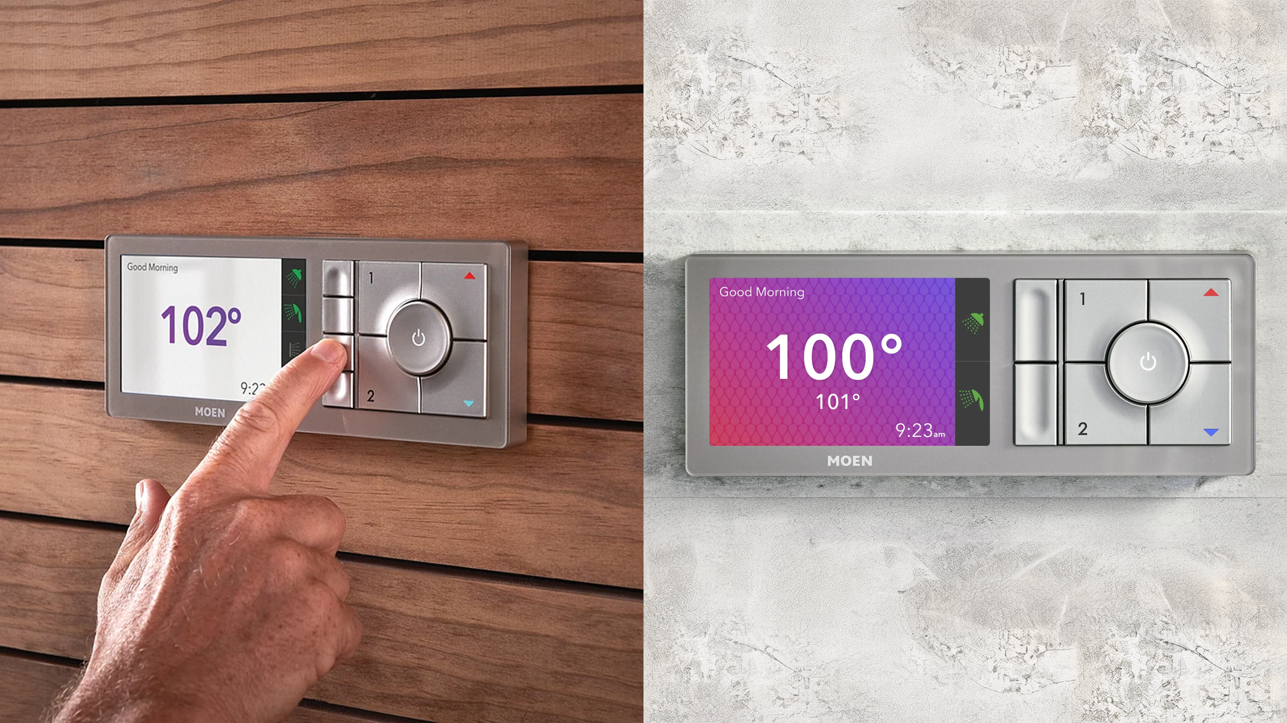
Two states of the interface shown with the product in different installed environments.
Background
In 2015, I joined Blink UX as a temporary freelancer. Blink was partnered with Moen, which had the technology in place to bring a connected smart shower to market. The goal: design an experience that empowers and delights customers through their daily shower routine.
Team & Role
I was the sole User Experience designer, working alongside one Design Lead and several team members in management roles. Research, strategy, and usability testing had already shaped the underlying user experience and customer experience foundations by the time I joined, so my focus narrowed to the visual language and aesthetics of the in-shower unit's digital screens.
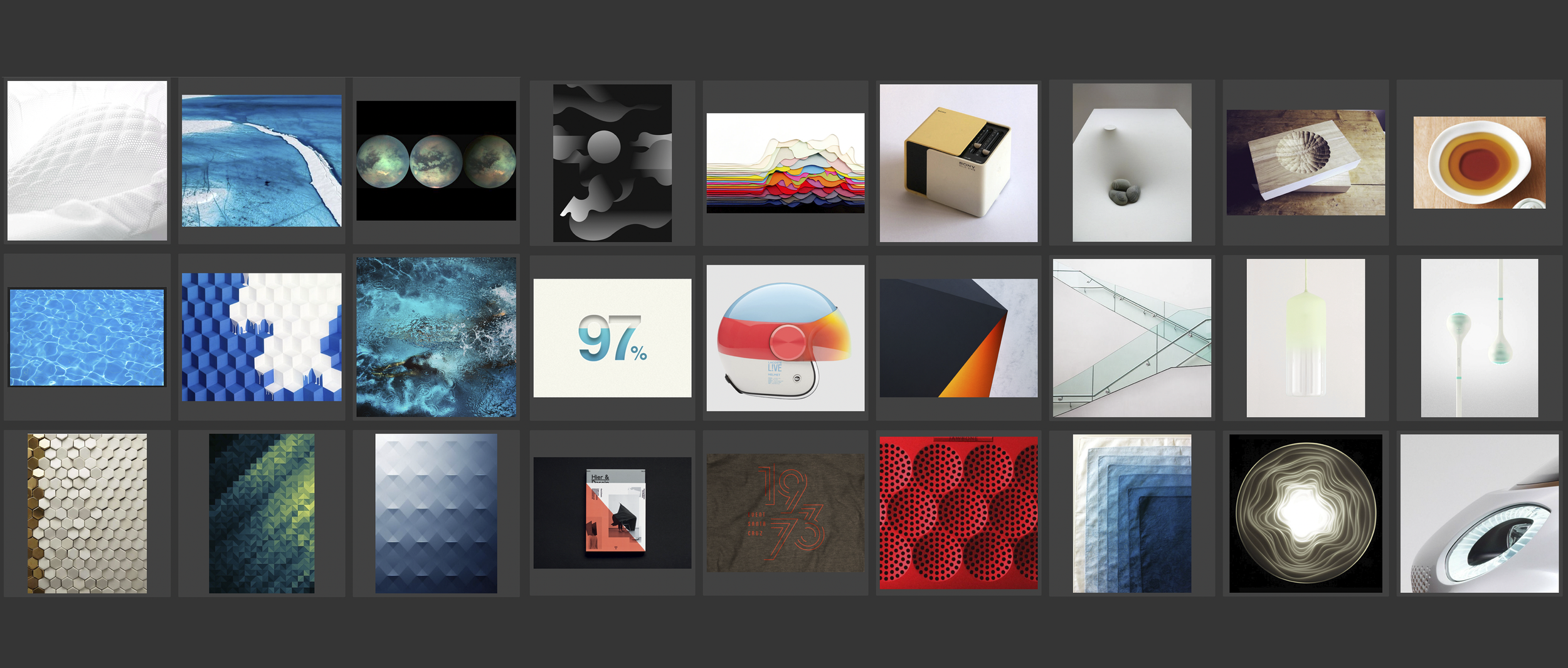
An early moodboard, focusing on tactile, minimal aesthetics with repeating, soothing patterns and translucent colors that might reflect elapsing time and warmth.
The Approach
I began with mood-boarding, exploring a range of conceptual themes and visual styles to establish the right tone for a premium, in-shower digital interface. From there, I dug deeper into typography and infographic approaches, testing how information could be displayed clearly and beautifully on a small screen. Through several rounds of feedback, critique, and team alignment, I narrowed the exploration down to three refined concepts, which went through several rounds of review with Moen.
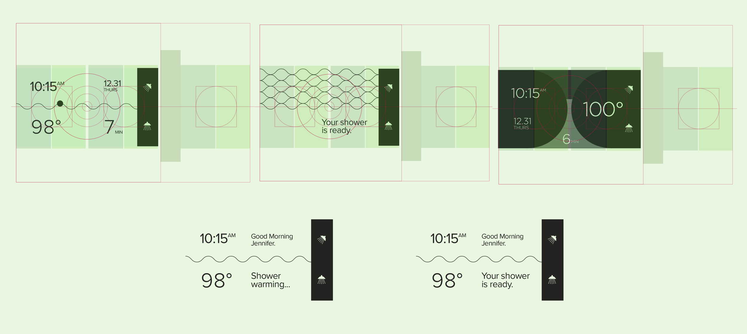
Early sketches, establishing a consistent grid and proportions for consistent infographic treatment.
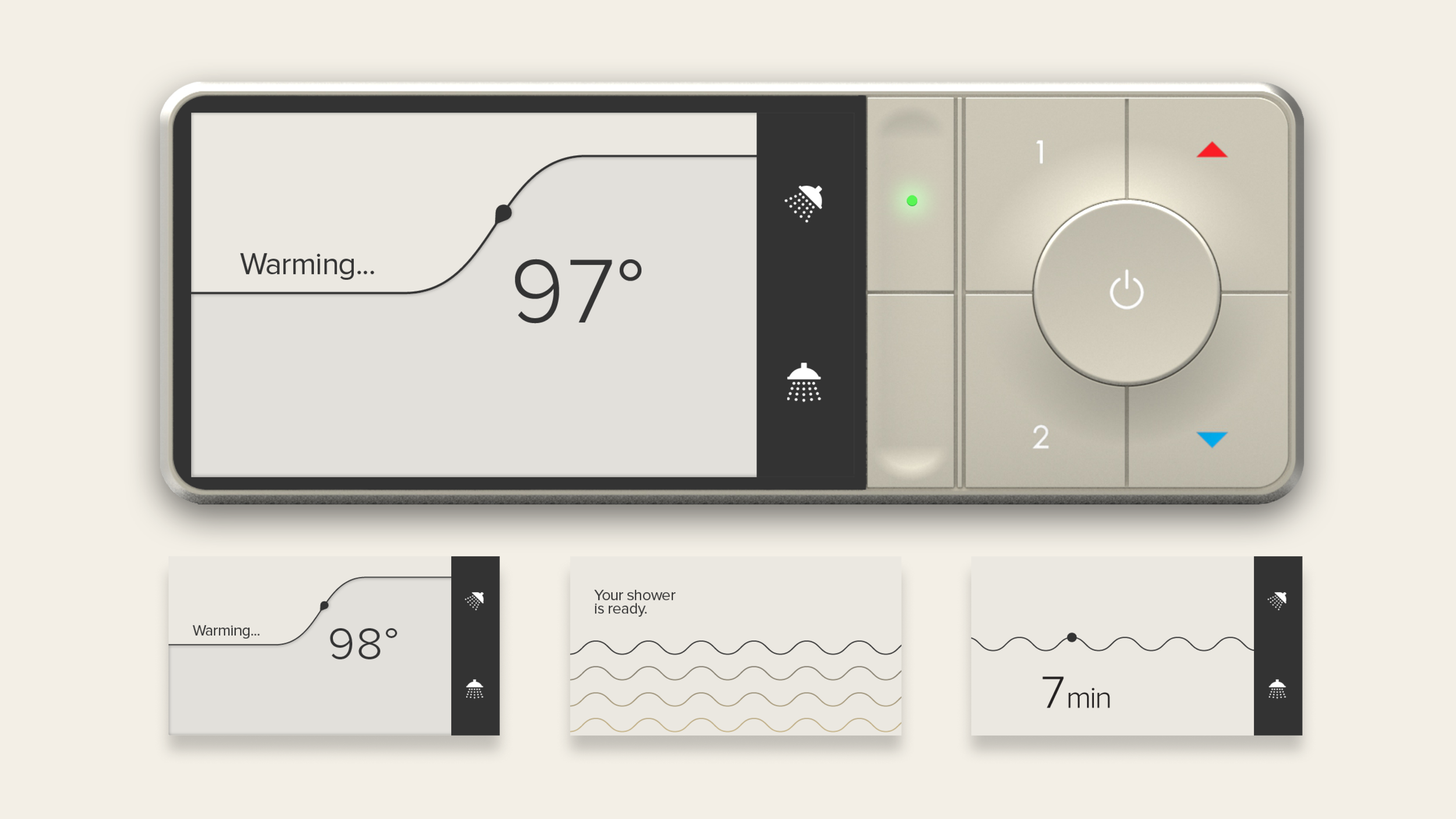
An early exploration in minimal design aesthetics, considering how the in-shower interface will be covered in steam and water during most of the shower time.
Challenges
The interface had to be legible and clear inside a wet and steamy environment, and early explorations prioritized clarity over decoration. A significant design question centered on how to visualize elapsed time, weighing a straightforward, infographic-style approach against a more metaphorical one.
Outcome
My contract wrapped before Moen made a final directional decision, but my concept work directly shaped the approved designs that shipped in the final product. In the following months and years, U by Moen went on to win multiple design awards and became a standout product at CES 2017.
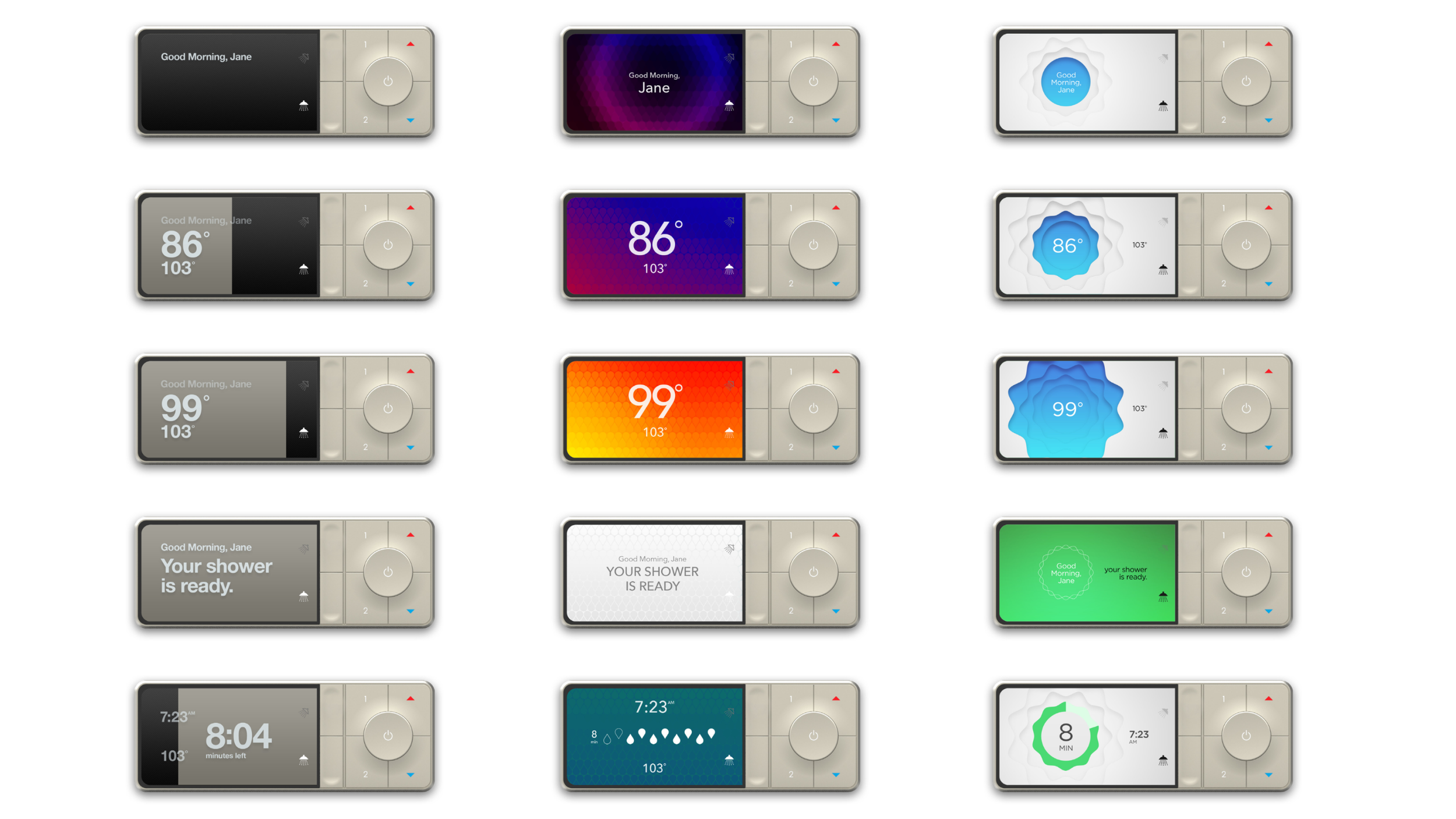
Three design directions that were presented to the client around the end of my contract. The central design became the foundation for the shipped, final interface.
Takeaways
This was one of my first opportunities to design for a physical luxury product interface, and it gave me a strong appreciation for the discipline of simple, modern infographic design under real physical constraints.